Kod: 02777441
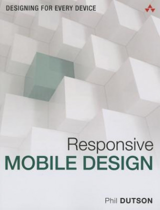
Responsive Mobile Design
Autor Phil Dutson
Suddenly, billions of people are accessing the web via smartphones and tablets of all shapes and sizes, using interfaces and displays of all kinds: touch screens, gestures, keyboards, mice, trackballs, high PPI screens, giant scre ... więcej
- Język:
 Angielski
 - Oprawa: Miękka
- Liczba stron: 256
Wydawca: Pearson Education, 2014
- Więcej informacji o książce

Zobacz książki o podobnej tematyce
-

Project: Level 2: Student's Book
91.11 zł -13 % -

Project: Level 3: Student's Book
91.11 zł -13 % -

Screw It, Let's Do It
52.35 zł -15 % -

Tiny Universal Waite Tarot Deck
46.51 zł -13 % -

Elements Of Graphic Design
125.55 zł -4 % -

Jihadist Threat
192.80 zł -

Responsive Web Design with Adobe Photoshop
60.60 zł -69 %
Powiadomienie o dostępności
Wpisz swój adres e-mail, aby otrzymać od nas powiadomienie,
gdy książka będzie dostępna. Proste, prawda?
Więcej informacji o Responsive Mobile Design
 Opis
Opis
Suddenly, billions of people are accessing the web via smartphones and tablets of all shapes and sizes, using interfaces and displays of all kinds: touch screens, gestures, keyboards, mice, trackballs, high PPI screens, giant screens, you name it. Responsive Mobile Design teaches you principles, techniques, and best practices for building sites that deliver a successful experience to all users on all devices. Writing for developers, designers, and managers, Phil Dutson shows how to create content that is responsive "from the start." He begins with crucial issues of design and strategy, and then delivers the technical know-how you need to transform responsive designs into responsive sites. Along the way, you'll find coverage of crucial issues such as integrating media content; optimizing performance; serving Retina or high-density displays; and using advanced server techniques to deliver content more efficiently. You'll discover tools for designing responsive sites more easily -- and above all, techniques for promoting responsiveness by keeping site development simple and flexible. Throughout, Dutson combines detailed and practical explanations with fully-functional code snippets designed for easy reuse; extensive downloadable resources are provided online. Features included in this book: * Learn why content matters * Discover why starting mobile first is the best practice * See how changing art direction with responsive images can be leveraged to improve the speed of your site as well as help convey your visual message * Learn about using a grid system with your design and how to avoid making it feel like your design has been placed in a box * Understand the important differences between measurement values such as px, em, rem, and viewport units * Improve the finer details of your design with web fonts * Retro-fit your current website with working paradigms that you will need for current and future development * Start incorporating web components into your HTML markup * Learn how to use built-in browser development tools to get the most out of your debugging or "in-browser" prototyping phase
 Szczegóły książki
Kategoria Książki po angielsku Computing & information technology Digital lifestyle Portable & handheld devices: consumer/user guides
- Pełny tytuł: Responsive Mobile Design
- Autor: Phil Dutson
- Język:
 Angielski
 - Oprawa: Miękka
- Liczba stron: 256
- EAN: 9780133888218
- ISBN: 0133888215
- ID: 02777441
- Wydawca: Pearson Education
- Waga: 478 g
- Wymiary: 230 × 179 × 13 mm
- Data wydania: 18. September 2014
Ulubione w innej kategorii
-

Node.js in Action, Second Edition
273.65 zł -

Progressive Web Apps
172.06 zł -5 % -

Drawing and Painting on the iPad
87.99 zł -14 % -

React Quickly
228.85 zł -5 % -

Amazon Prime
58.69 zł -

PostGIS in Action
273.65 zł -

Samsung Galaxy Tab For Dummies
107.62 zł -11 % -

Get going with Amazon Echo and Alexa in easy steps
32.11 zł -14 % -

Samsung Galaxy S4 Owner's Manual
76.81 zł -

My Google Chromebook
109.44 zł -5 % -

Fire Phone - Out of the Box
31 zł -

Kindle Paperwhite User Guide
130.92 zł -

iPad Geekery
123.53 zł -15 % -

How to Speak Droid with R2-D2
80.94 zł -7 % -

Droid X2
82.55 zł -4 % -

Joy of Geocaching: How to Find Health, Happiness and Creative Energy
70.67 zł -5 % -

App Inventor 2 Essentials
160.59 zł -

Custom Raspberry Pi Interfaces
178.61 zł -5 % -

Kindle Fire Geekery: 50 Insanely Cool Projects for Your Amazon Tablet
132.49 zł -5 % -

Android Tablets Made Simple
159.38 zł -5 % -

Kindle Fire
82.55 zł -4 % -

iPad Made Simple
120.91 zł -5 % -

Tablet PCs for Seniors in Easy Steps
57.48 zł -14 % -

Understanding Android Tablets and Smartphones for All Ages
47.31 zł -23 % -

Help Me! Guide to the iPad Air 2
59.86 zł -

Beginning BlackBerry Development
157.36 zł -4 % -

Taking Your iPad to the Max
120.91 zł -5 % -

Blackberry Hacks
140.15 zł -5 % -

Galaxy Tab
82.55 zł -4 % -

jQuery Mobile
84.57 zł -

Inside Guide to the iPad for Seniors
51.64 zł -5 % -

iPad Kickstart
128.67 zł -4 % -

Intelligent Assistant Systems
533.93 zł -

BlackBerry 10 Application Sketch Book
83.26 zł -

BlackBerry for Work
120.91 zł -5 % -

Jumpstarting the Raspberry Pi Zero W
55.37 zł -5 % -

Introduction to the iPad with iOS10
38.25 zł -23 % -

Paperwhite Users Manual
51.44 zł -

Kindle Voyage Users Manual
54.06 zł -

Clever Stuff You Can Do with Your Apple Gadgets
32.11 zł -14 % -

Get Going with Kindle Fire in Easy Steps
32.11 zł -14 % -

iPad for Seniors QuickSteps
97.66 zł -23 % -

Parent's Guide to the iPad in easy steps
57.48 zł -14 % -

Hudl in easy steps
57.48 zł -14 % -

iPad in Easy Steps
57.48 zł -14 % -

iPad in easy steps
57.48 zł -14 % -

Ipad 2 in Easy Steps
57.48 zł -14 % -

Designing for Wearables
126.45 zł -10 % -

iPad for Seniors in easy steps
70.17 zł -11 %
zadowolonych klientów
Od roku 2008 obsłużyliśmy wielu miłośników książek, ale dla nas każdy był tym wyjątkowym.
Copyright! ©2008-24 libristo.pl Wszelkie prawa zastrzeżonePrywatnieCookies


 21 milionów książek
 Dostawa 10.99 zł
 (32) 444 93 66 (8-15.30h)